Clik here to view.

Now we have the environment installed, and we have had some practice with commands and we have learnt the various libraries, and which are the most important. The time has come to start our predictive experiment.
We will work with one of the most highly recommended datasets for beginners, the iris dataset. This collection of data is very practical because it’s a very manageable size (it only has 4 attributes and 150 rows). The attributes are numerical, and it is not necessary to make any changes to the scale or units, which allows a simple approach (as a classification problem), as well as a more advanced one (such as a multi-class classification problem). This dataset is a good example to use to explain the difference between supervised and non-supervised learning.
The steps that we are going to take are as follows:
- Load the data and modules/libraries we need for this example
- Exploration of data
- Evaluation of different algorithms to select the most adequate model for this case.
- The application of the model to make predictions from the ´learnt´
So that it isn’t too long, in this 4 th post we will carry out the first two steps. Then in the next and last one, we will carry out the 3rd and 4th.
1. Loading the data/ libraries/ modules
We have seen, in the previous post, the large variety of libraries that we have at our disposal. There are distinct modules in each one of these. But in order to use the modules as well as the libraries, we have to explicitly import them (except for the standard library). In the previous example some of the libraries are needed to check the versions. Now, we will import the modules we need for this particular experiment.
Create a new Jupyter Notebook for the experiment. We can call it ´Classification of iris´. To load the libraries and modules we need, copy and paste this code:
Continuing on, we will load the data. We´ll do this directly from Machine Learning UCI repository. For this we use the pandas library, that we just loaded, and that will be useful for the explorative analysis of the data, because it has data visualisation tools and descriptive statistics. We only need to know the dataset URL and specify the names of each column to load the data (‘sepal-length’, ‘sepal-width’, ‘petal-length’, ‘petal-width’, ‘class’). To load the data, type or copy and paste this code:
You can also download the csv of the dataset onto your working directory and substitute the URL for name of the local file.
2. Data exploration
In this phase we´re going to focus on topics such as the dimension of the data and what aspect it has. We will do a small statistic analysis of its attributes and group them by class. Each one of these actions doesn’t it is not more difficult than the execution of a command that, in addition, you can reuse again and again in future projects. In particular, we will work with the function shape, that will give us the dimensions of the dataset, the function head, which will show us the data (it indicates the number of records that we want it to show us), and the function describe, that will give us the statistical values of the dataset.
Our recommendation is that you try it one by one as you continue to find each one of the commands. You can also type them directly or copy and paste them in your Jupyter Notebook. (use the vertical shift bar to get to the end of the cell). Each time you add a function, execute the cell using (Menú Cell/Run Cells).
As a result, you should get something like this:
Clik here to view.
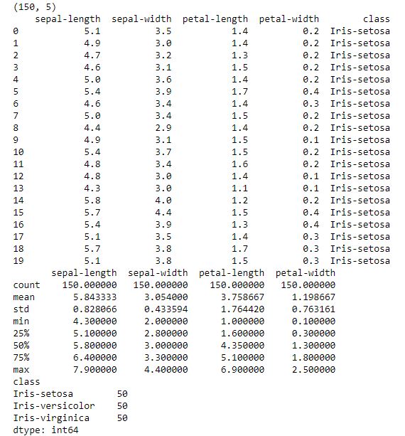
And so, we see that this dataset has 150 instances with 5 attributes, we see the list of the first 20 records, and we see the distinct values of longitude and the width of the petals and sepals of the flower that, in this case, correspond to the Iris-setosa class. At last, we can see the number of records that there are in the dataset, the average, the standard deviation, the maximum and minimum values of each attribute and some percentages.
Now we will visualise the data. We can produce graphs of a variable, which will help us to better understand each individual attribute, or multivariable graphs, which hallows us to analyse the relationship between the attributes. Its our first experiment, and we don’t want to over complicate it, so we will only try the first ones.
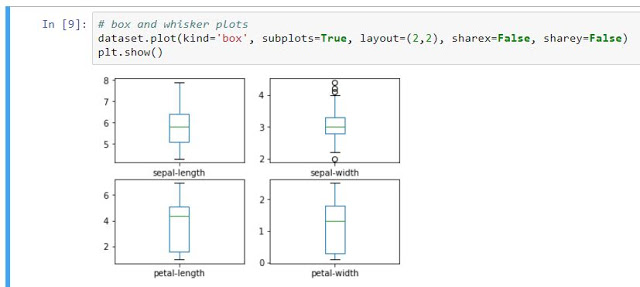
As the beginning variables are numerical, we can create a box and whisker plot diagram, which will give us a much clearer idea of the distribution of the starting attributes (longitude and width of the petals and sepals). For this, we just have to type or copy and paste this code:
By executing this cell, we get this result:
Clik here to view.
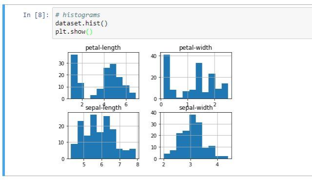
We can also create a histogram of each attribute and variable to give us an idea of what type of distribution follows. For this, we don’t need to do more than add the following commands to our Jupyter Notebook (as in the previous example, better to do it one by one):
We execute the cell, and we get this result. At a first glance, we can see that the related variables are the sepals, they appear to follow a Guissiana distribution. This is very useful because we are able to use algorithms that take advantage of the properties of this group of distributions.
Clik here to view.
And so now we´re almost finished. In the following post we will finalise our first Machine Learning experiment with Python. We will evaluate different algorithms around the conjunction of validation data, and we will choose which offers us the most precise metrics to expand our predictive model. And, at last, we will use the model.
The posts in this tutorial:
- Dare with Python: An experiment for all (intro)
- Python for all (1): Installation of the Anaconda environment.
- Python for all (2): What are the Jupiter Notebook ?. We created our first notebook and practiced some easy commands.
- Python for all (3): ScyPy, NumPy, Pandas…. What libraries do we need?
- Python for all (4): Data loading, exploratory analysis (dimensions of the dataset, statistics, visualization, etc.)
- Python for all (5) Final: Creation of the models and estimation of their accuracy
Don’t miss out on a single post. Subscribe to LUCA Data Speaks.
You can also follow us on Twitter, YouTube and LinkedIn
The post Python for all (4): Data loading, explorative analysis and visualisation appeared first on Think Big.